Mesmerising intro from the brand name sets this agency apart from the very first moment. The small font size and wide white spaces help portfolio pieces to stand out.
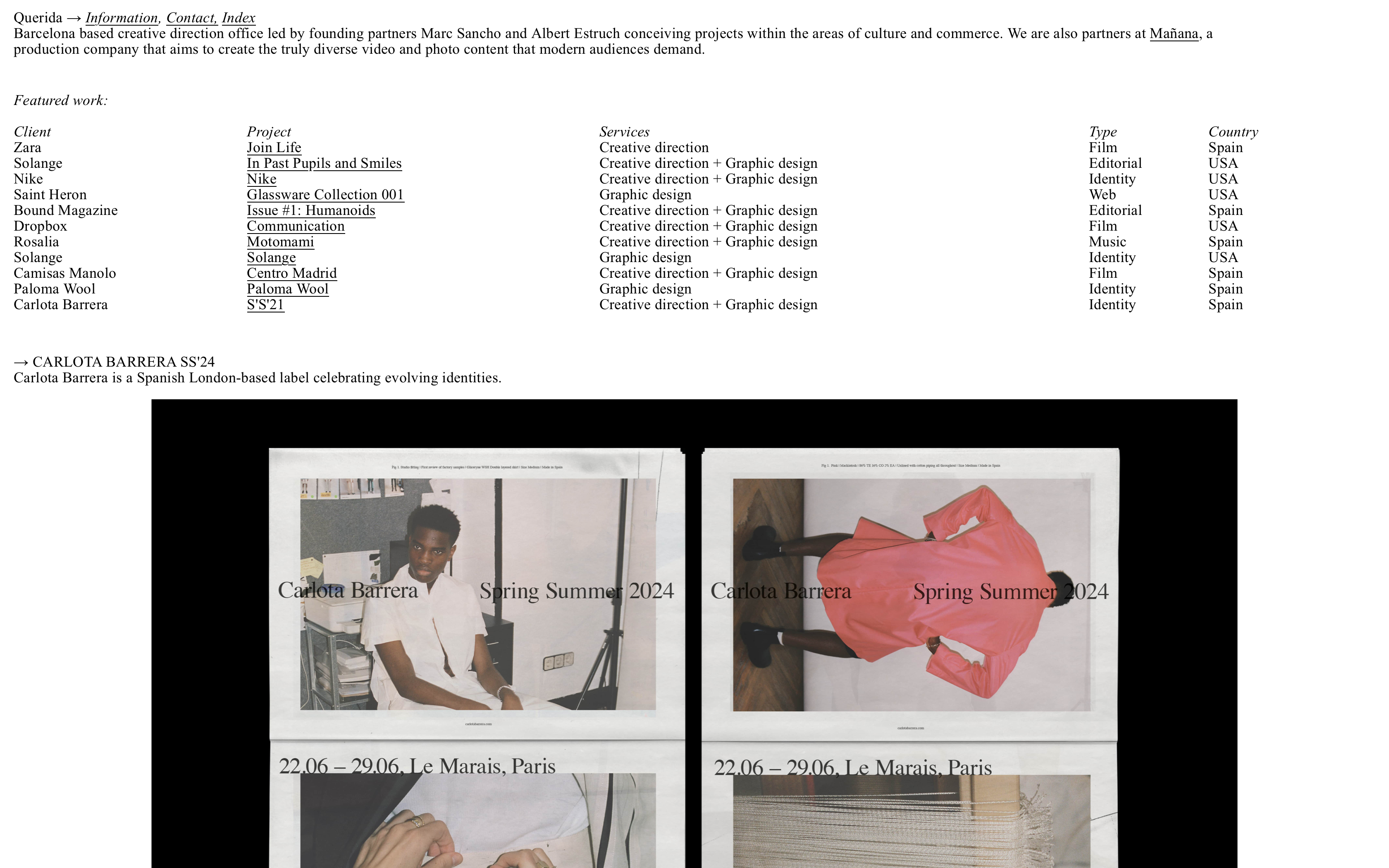
I've always been a fan of Querida's simplistic approach. All you need 1 size font and 1 simple page website to showcase your work!
This sharp, simple website by a group of creatives makes a fun use of vivid colours that take over the whole page.
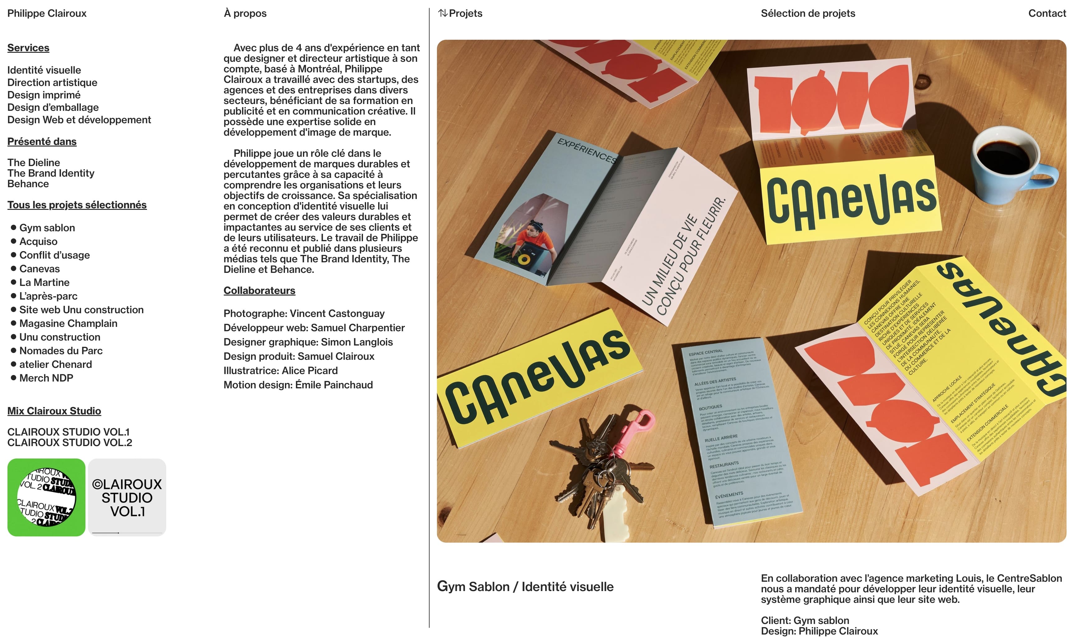
This simple layout that gives me agency info at the left and the portfolio at the right feels so effortless.
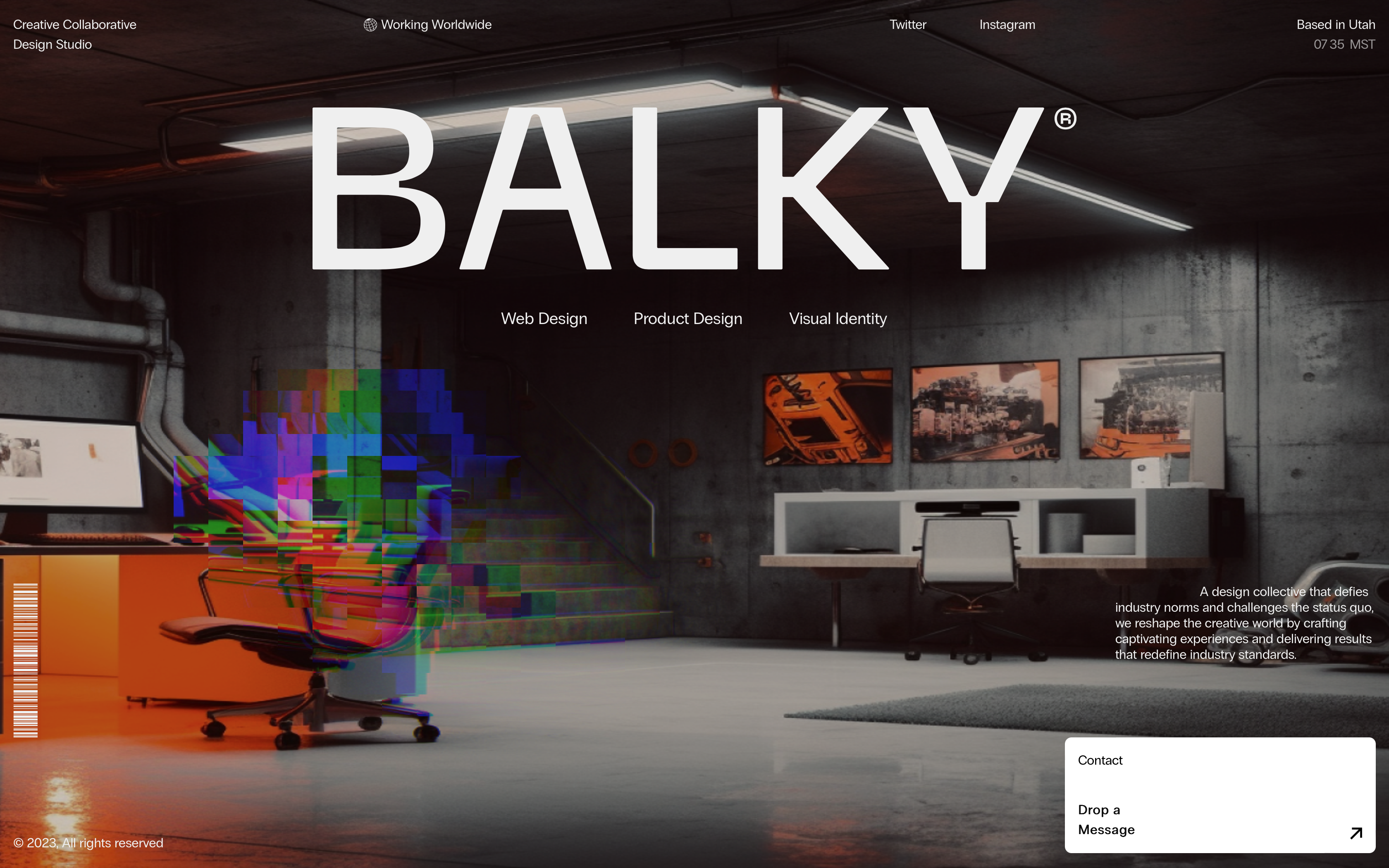
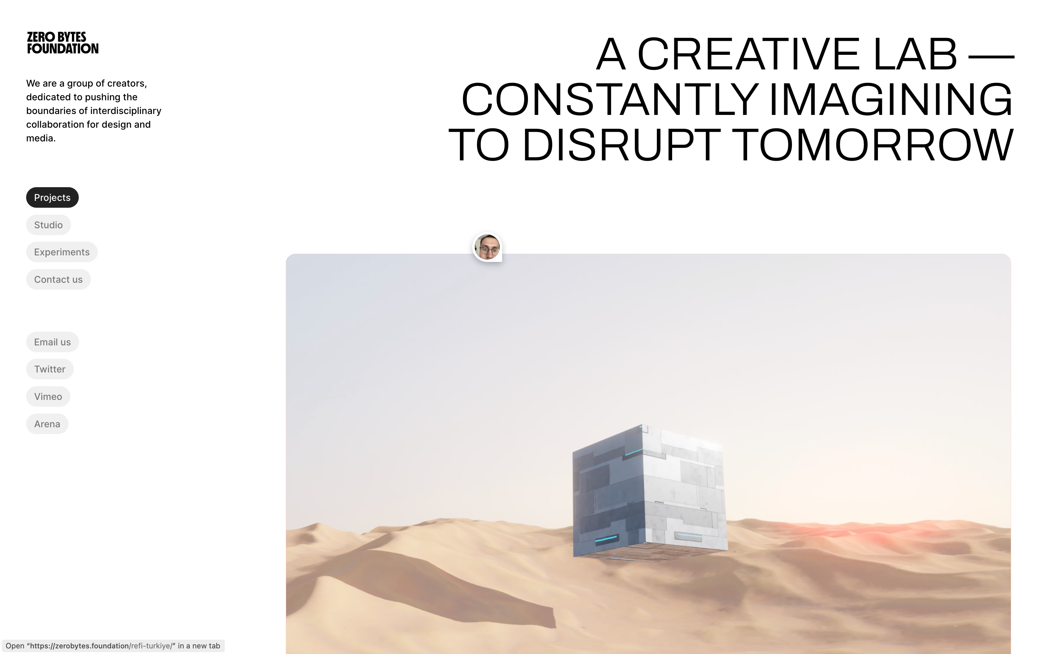
Full-screen placeholder website with interesting hovering interaction with the beautifully designed background image.
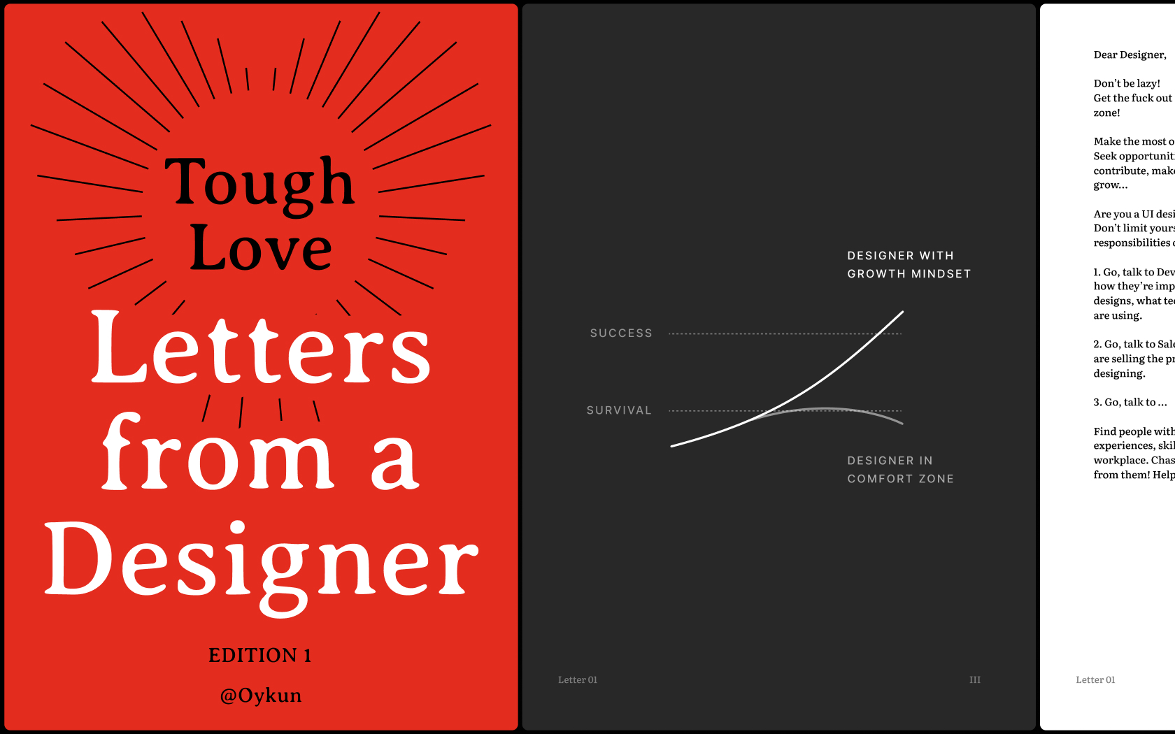
Unlock your full potential, gain new perspectives and break free from self-limitations with the collection of inspiring and honest letters born out of Tough-Love
.jpg)
Editorial look with its clean design and big typography is a style I usually cherish. Changing background colours as you scroll adds more personality to the website.
- Portfolio
- E-Commerce
- Agency
Type
- Software
- AI
- Blockchain
- Media
- Architecture
- Fashion
- Design
Industry
- Serif
- Display
- Sans Serif