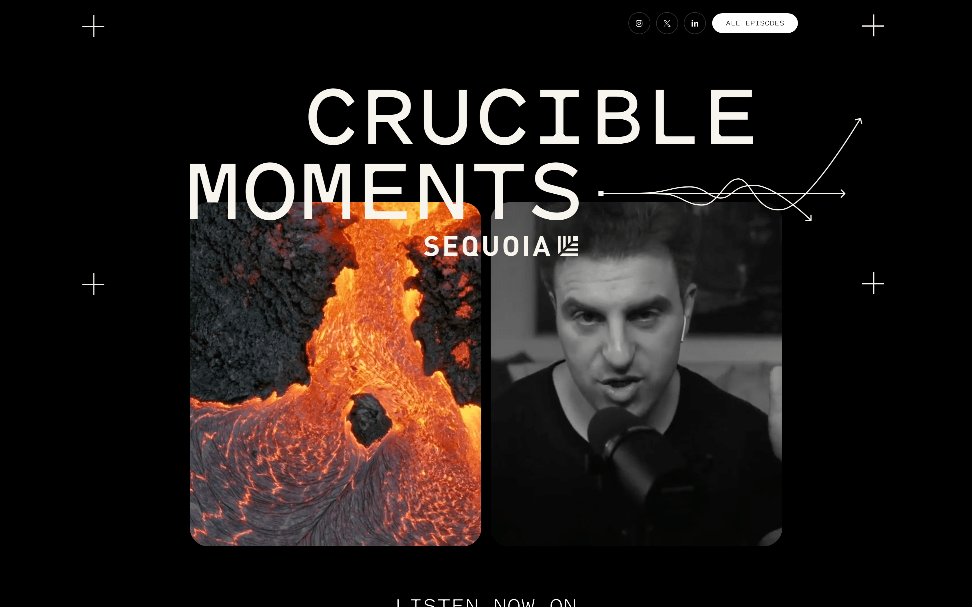
Beautiful use of large photography, the combination of vivid colours on black and big typography.

Mesmerising intro from the brand name sets this agency apart from the very first moment. The small font size and wide white spaces help portfolio pieces to stand out.
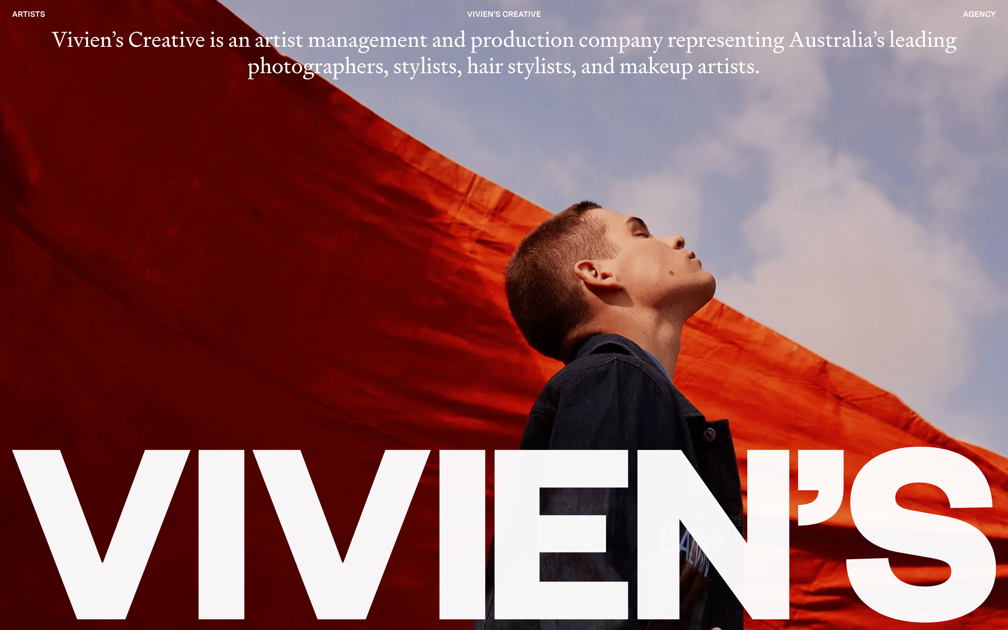
Impactful photography combined with large typography makes this website stand out. I also appreciate the great use of Serif and Sand Serif on the same page.
I love the fun typographic play in the intro. It helps their brand name to stick with visitors. Smart! Then as I scroll down the page, the editorial content takes over. I love this look and feel.
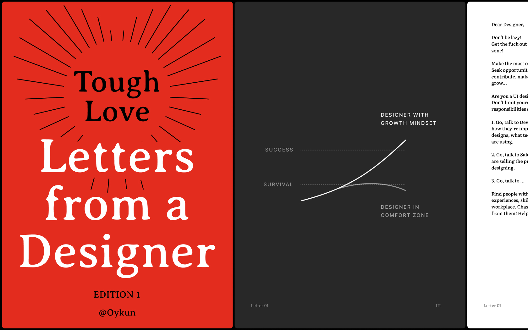
Unlock your full potential, gain new perspectives and break free from self-limitations with the collection of inspiring and honest letters born out of Tough-Love
-min.png)
Always have been a fan of Palantir's clean design approach. Proves that you don't need to fill your website with lots of illustrations to make it appealing.
- Portfolio
- E-Commerce
- Agency
Type
- Software
- AI
- Blockchain
- Media
- Architecture
- Fashion
- Design
Industry
- Serif
- Display
- Sans Serif