Mesmerising intro from the brand name sets this agency apart from the very first moment. The small font size and wide white spaces help portfolio pieces to stand out.
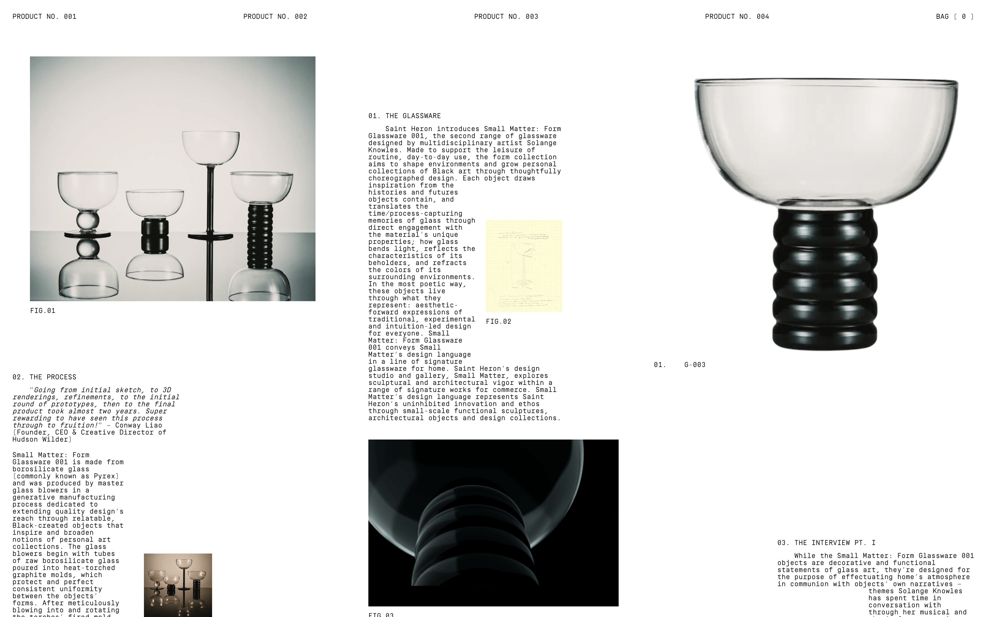
Creative layouts for creative results. I love how images interrupt the copy, that has only 1 size, give them unique shapes.
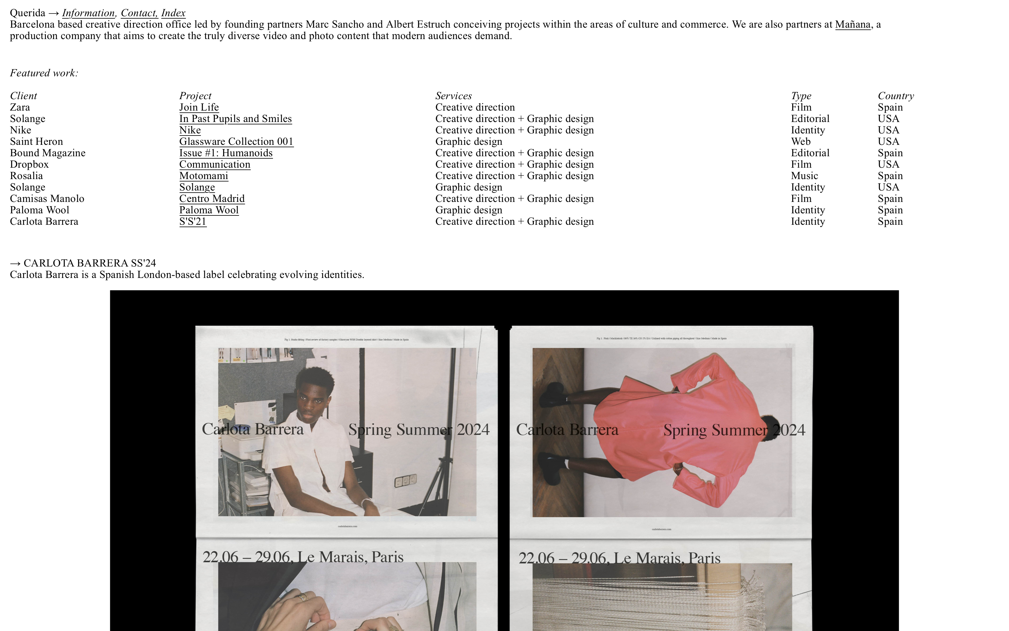
I've always been a fan of Querida's simplistic approach. All you need 1 size font and 1 simple page website to showcase your work!
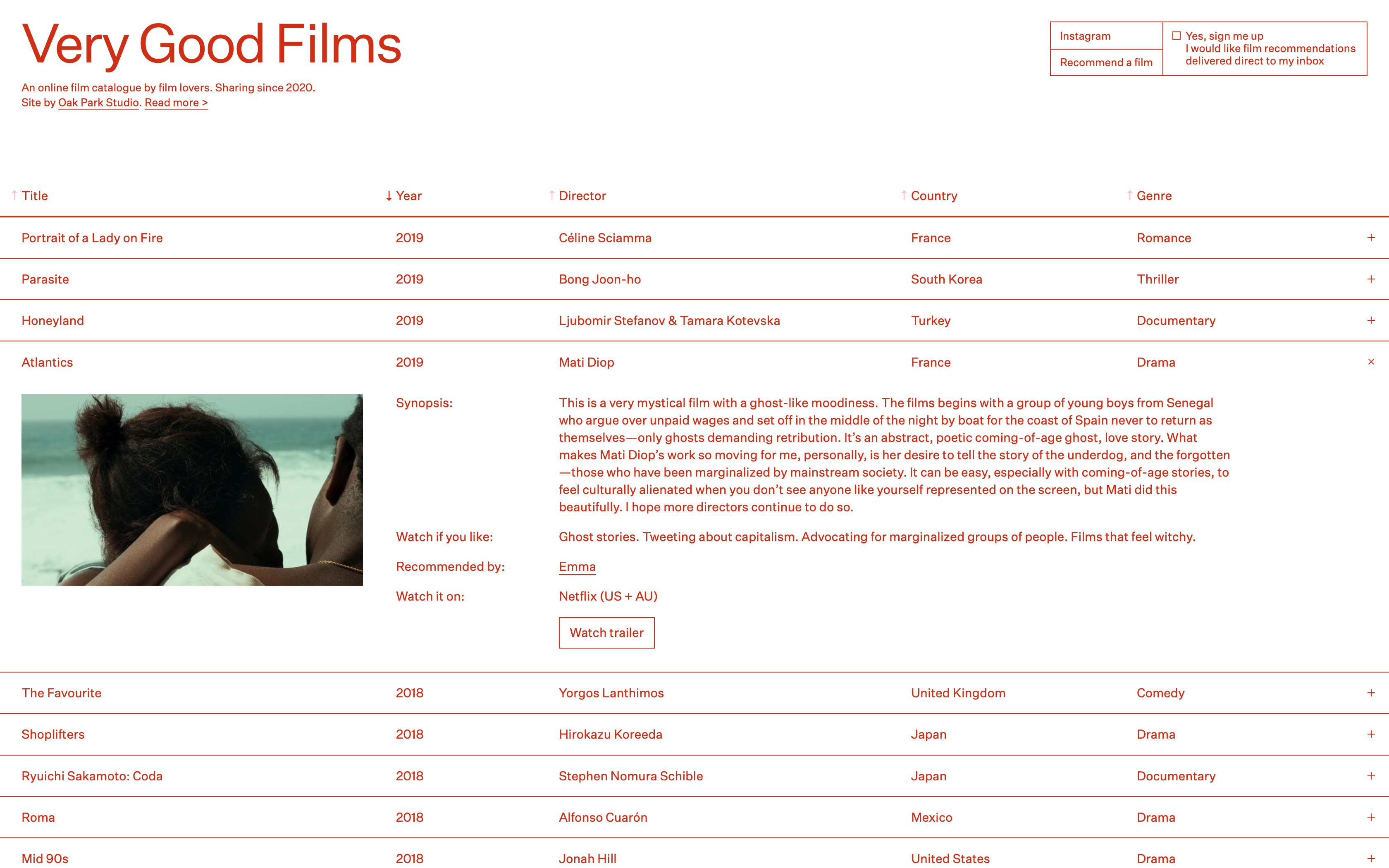
Simple, yet memorable website by Oak Park Studio. Appreciate the daring move of using 1 colour only and especially red : )
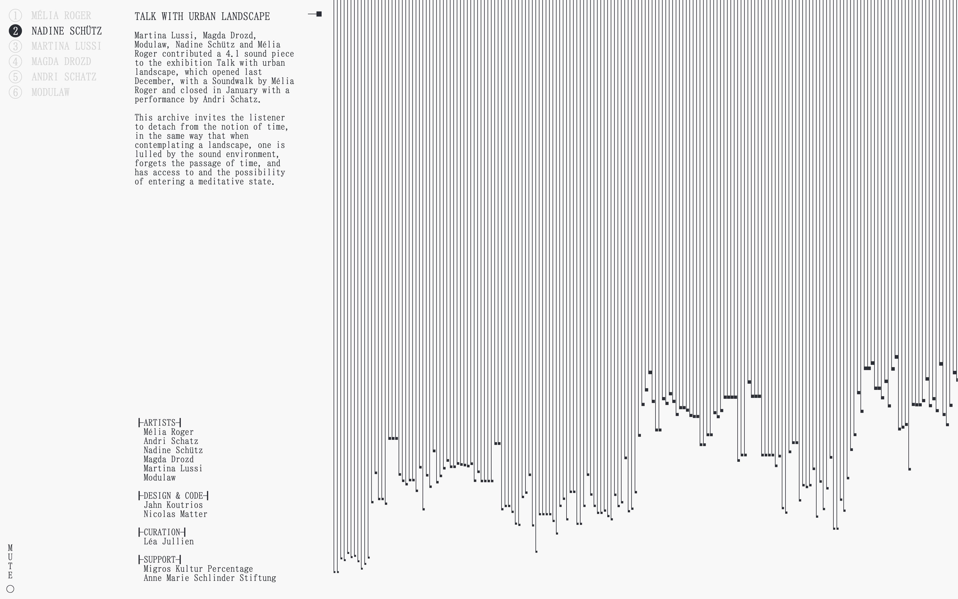
An audio project with a minimal, clean, sharp design approach. I find such experimental projects so inspiring!
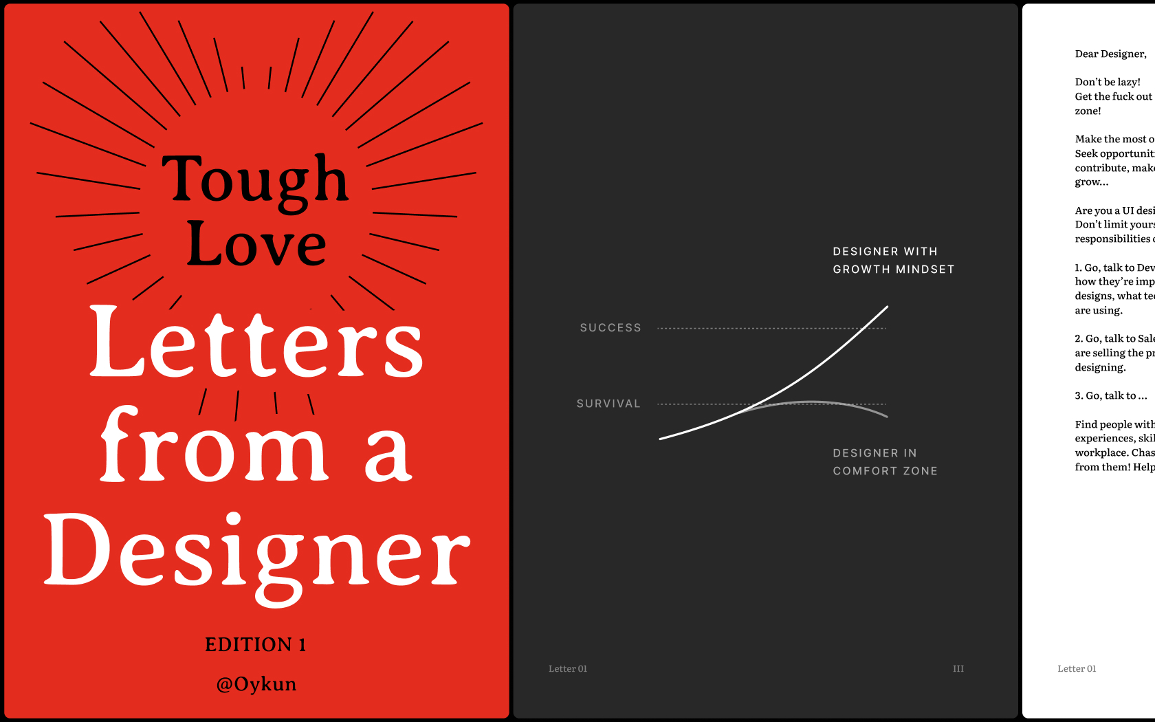
Unlock your full potential, gain new perspectives and break free from self-limitations with the collection of inspiring and honest letters born out of Tough-Love
I love the fun typographic play in the intro. It helps their brand name to stick with visitors. Smart! Then as I scroll down the page, the editorial content takes over. I love this look and feel.
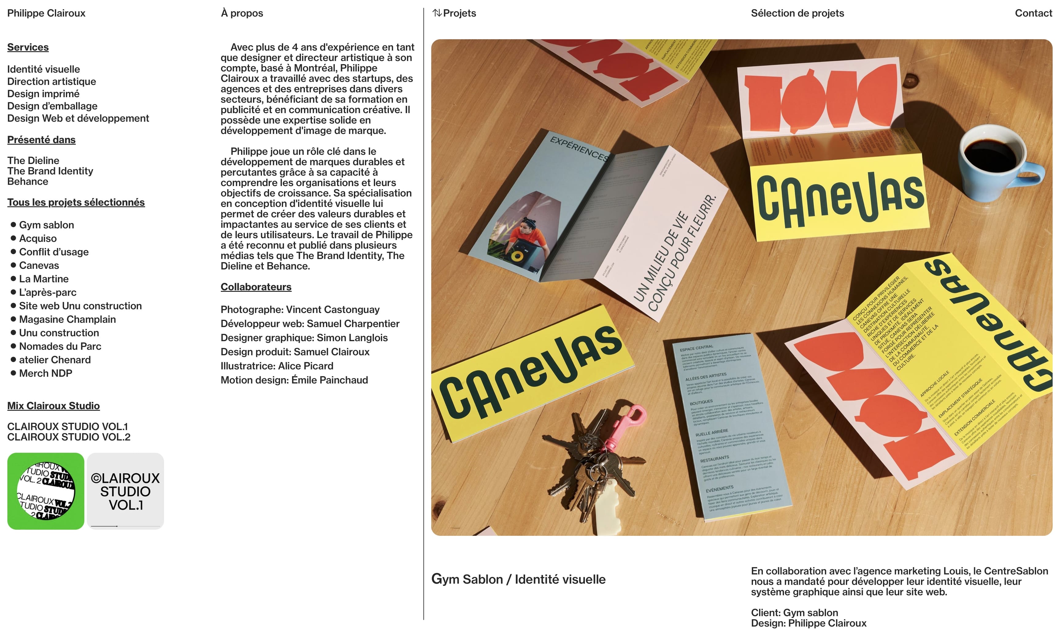
This simple layout that gives me agency info at the left and the portfolio at the right feels so effortless.
- Portfolio
- E-Commerce
- Agency
Type
- Software
- AI
- Blockchain
- Media
- Architecture
- Fashion
- Design
Industry
- Serif
- Display
- Sans Serif