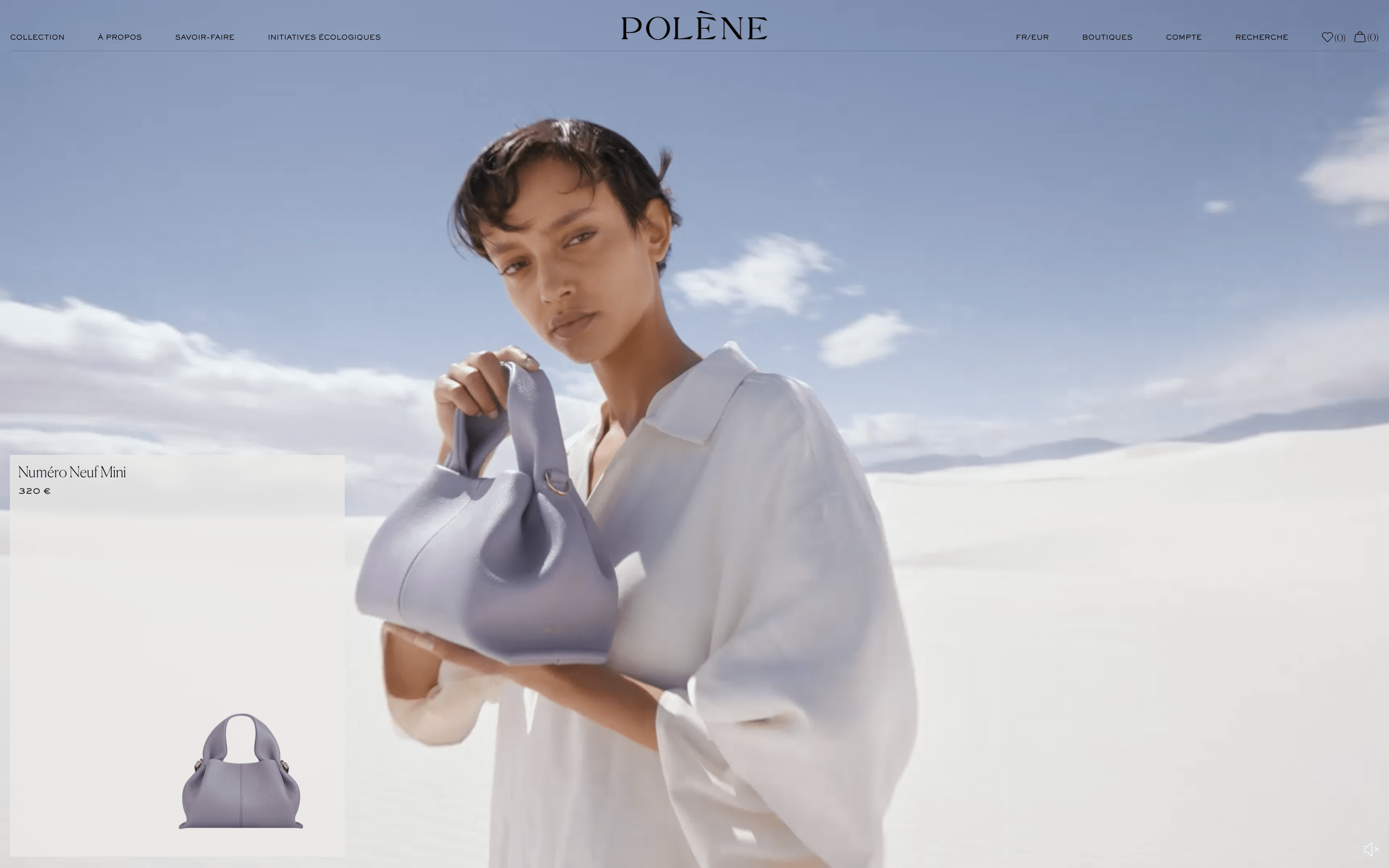
A large serif title paired with a small sans serif body copy in this editorial layout greatly helps to achieve the classy look that the brand aims for. Btw that blurry bg effect in the nav is a delight.
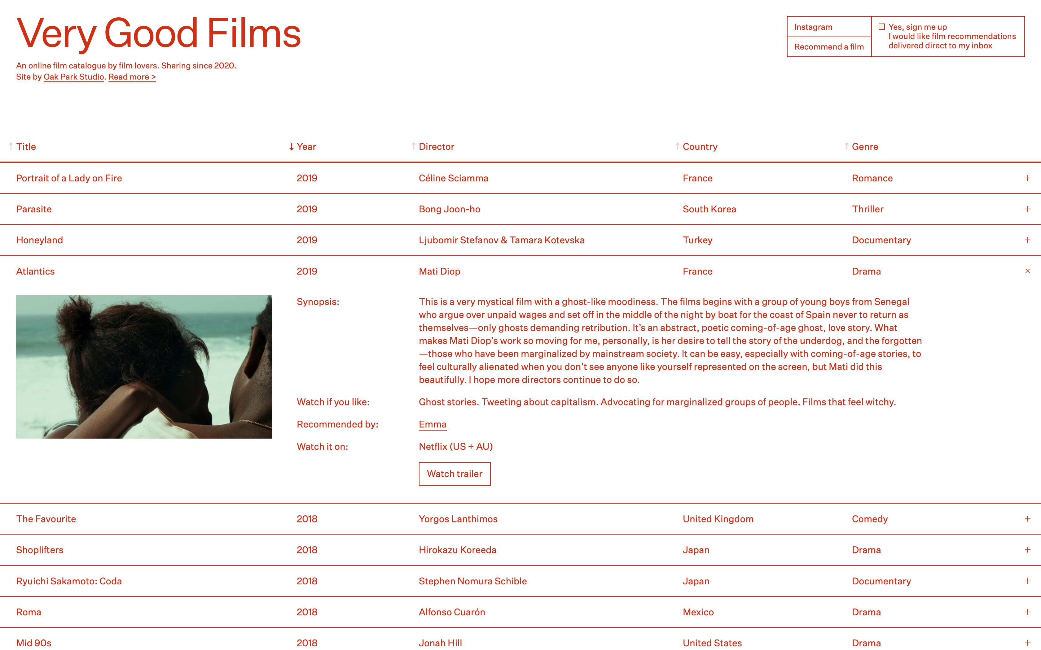
Simple, yet memorable website by Oak Park Studio. Appreciate the daring move of using 1 colour only and especially red : )
- Portfolio
- E-Commerce
- Agency
Type
- Software
- AI
- Blockchain
- Media
- Architecture
- Fashion
- Design
Industry
- Serif
- Display
- Sans Serif